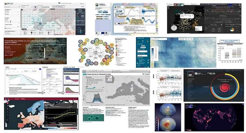
S2S4E took part in a workshop that gathered together European projects from the Climateurope network to show the state of the art of climate visualisations.
The big challenge of a climate service is communicating climate information to those in charge of making decisions based on these data, that are not always familiar with technical concepts. Visualisation of climate services becomes then a crucial issue to transfer knowledge in a user-friendly way, empowering stakeholders to make informed decisions for economic and societal benefits, regardless of their scientific knowledge.
The different aspects of data visualisation were among the topics tackled in a dedicated workshop organised in the framework of the Climateurope initiative for projects from their climate services network. The final goal was to have a synthesis of the state of the art of climate visualisations and compile lessons learned to create a document with useful recommendations for the next generation of climate services.
After a preparatory meeting involving 25 participants from interested climate services projects, the workshop was held on 19 November 2020 during the 4th Climateurope webstival, being conducted by Isadora Jiménez and Marta Terrado from the Barcelona Supercomputing Center (BSC). The interactive presentation allowed the participants to have a live discussion on visualisation topics, sharing their personal views and professional experiences.
Most of the participants agreed on the importance of simplifying complex information to make it accessible and easy to understand for decision-makers and other stakeholders. To achieve this critical goal, the motto "a picture is worth a thousand words" prevailed among climate services providers over other formats like reports or long texts.
Communicating uncertainty and probabilities to stakeholders
Different ways of displaying climate information for different kinds of users were shown during the workshop, from weather forecasts to seasonal predictions, long-term climate projections or climate change scenarios. The main challenge of these climate service visualisations, according to participants’ feedback, was communicating uncertainty and probabilities to stakeholders. Showing interactive options, using scenarios, focusing on extreme events, or providing averages and ranges were among the possible options mentioned by providers of climate services.
Skill, anomaly, percentile, uncertainty, or model are among the common technical terms used by climate experts. Choosing the right terminology for non-climate experts was another difficult task discussed during the event. There was a general consensus that terminology needs to be adapted to the users’ expertise in favour of understanding. In addition, using the local language of stakeholders to deliver climate services could be an advantage in some situations.
Keep it simple, that can be considered the main takeaway of the climate services visualisation workshop organised by Climateurope. Other key aspects to take into account were following a user-centred design (UCD) approach, dosing information, using storytelling and putting into practice a multidisciplinary approach involving climate scientists, designers, experts in user experience, social scientists and communication experts. Everything possible to try to find the perfect balance between scientific precision and general understanding.
The case of the S2S4E Decision Support Tool (DST)
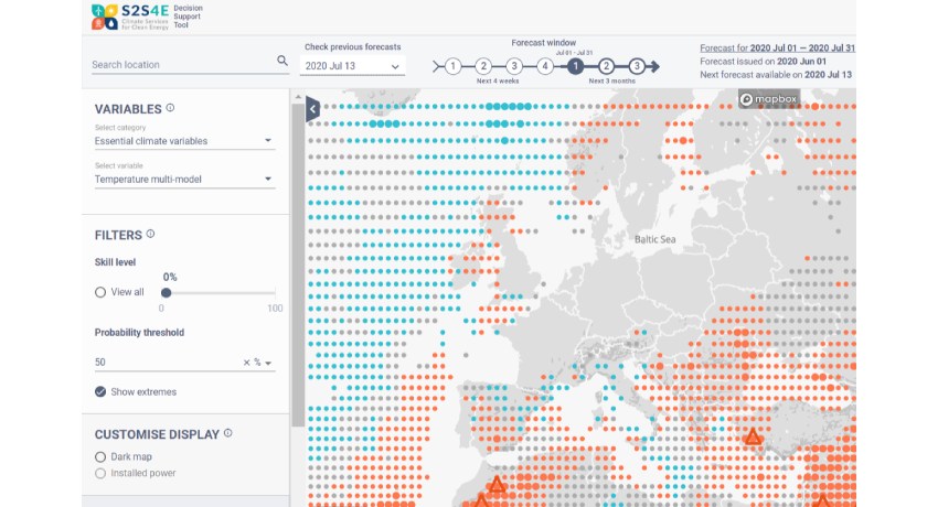
S2S4E was one of the EU-funded projects that took part in the webinar organized by Climateurope. The Decision Support Tool (DST), the sub-seasonal to seasonal forecasting tool developed in the S2S4E project, was an illustrative example of an interactive service where users can clearly visualize climate data in an understandable way.
From June 2019, the DST is an online operational tool for energy decision-makers in solar, wind and hydropower production, and energy demand. The service allows users to explore probabilistic predictions of essential climate variables, such as precipitation, solar radiation, temperature and wind, as well as energy indicators, for weeks and months ahead.
The challenge for the creation of a successful DST was the complexity of probabilistic forecasts, and how to communicate forecast uncertainty to decision-makers. To solve probability and uncertainty communication, the DST map interface included three main features: color, size and a subtractive filter, which facilitate visualisation and user experience.
The prediction is shown as a circle in a map, the color of which conveys the most probable of three categories (above-orange, below-blue or normal-grey) in the future trend of a selected variable. To visualize the probability, as only categories predicted with high probability might trigger a decision, users can set a threshold that encodes a larger circle’s size enabling fast visual detection. Triangle figures indicate regions where the forecast predicts the probability of an extreme event.
A user-centered design process was essential in the development of the DST. Multiple interviews, including eye-tracking experiments, were done until the users identified clearly and quickly regions with increasing or decreasing trends and their interactivity was intuitive. The result has been a tool available to everyone that someone without too much experience in climate forecasts can use and understand.
Written by Jose L. Cánovas (Barcelona Supercomputing Center)